Sentimental Analysis With Tableau and Python

What is Sentimental Analysis ?

Sentiment Analysis is the method of analysis to determine whether a piece of information is positive, negative or neutral.

Step-1 Connectivity between Python and Tableau

  • Install Anaconda software for your respective environment
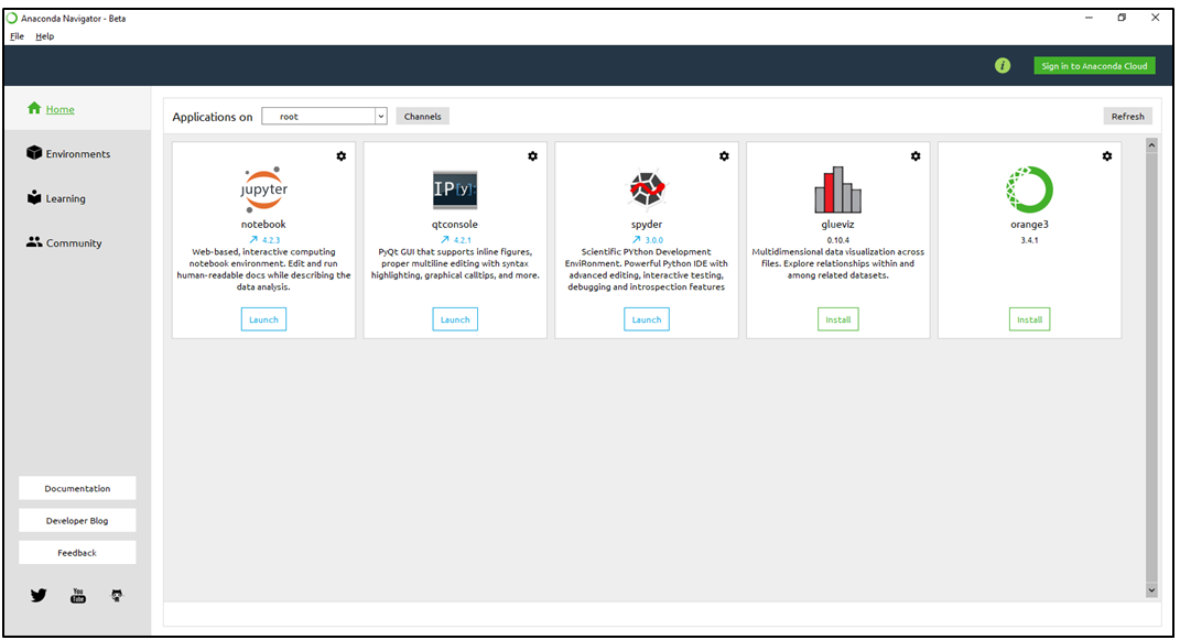
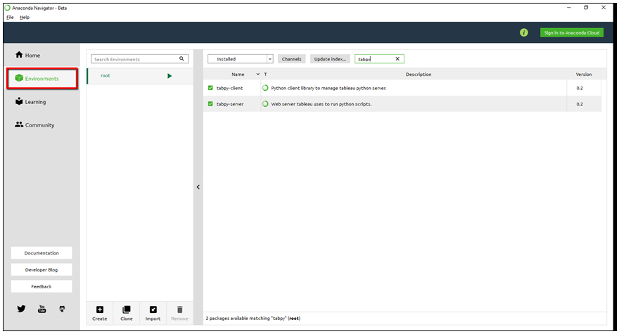
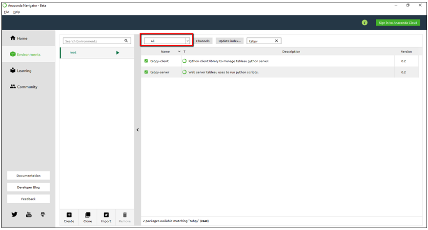
  • Open Anaconda Navigator & install Tabpy-Server & Tabpy-Client packages
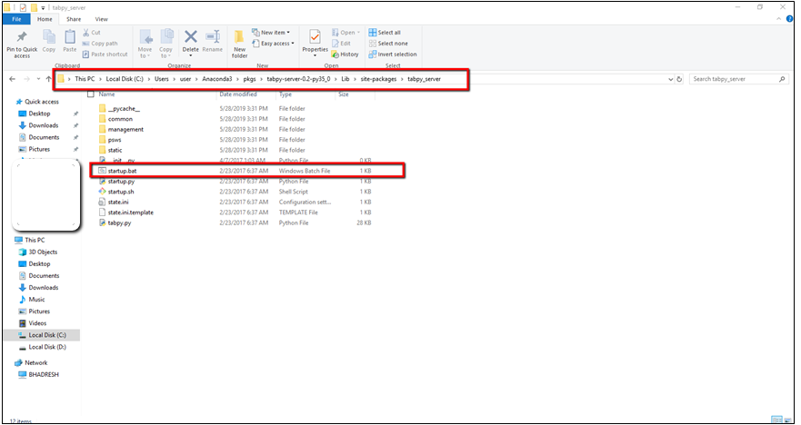
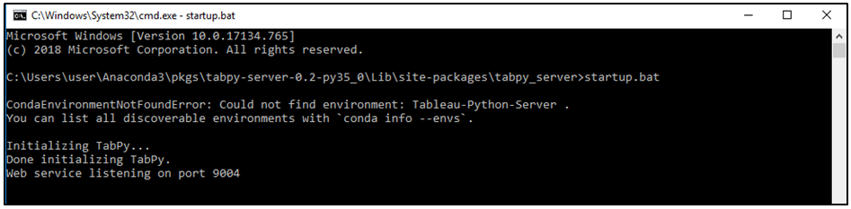
  • Go to respective location  where your Tabpy packages installed  For Example C:\Users\..\Anaconda3\Lib\site-packages\tabpy_server to run startup.bat file

Default port will listen on 9004

For more detail to integration between Tableau and Python . Please read blog http://www.bituskers.com/python-integration-with-tableau/

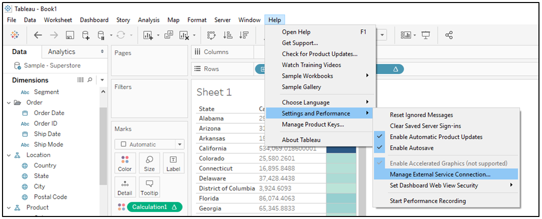
Step-2 Now Open Tableau Software and Click on Help -> Setting and Performance ->  Manage External Service Connection.

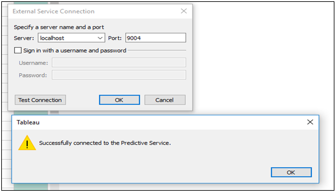
Click on “Test Connection” button to  check service between Python & Tableau. If successful message prompt then we have done connectivity successfully.

What is Vader Sentimental Analysis?

Vader is a lexicon and rule-based sentiment analysis tool that is specifically attuned to sentiments expressed in social media.

Step-3 Do install package “vaderSentiment” in Python Environment. Below is command.

pip install vaderSentiment

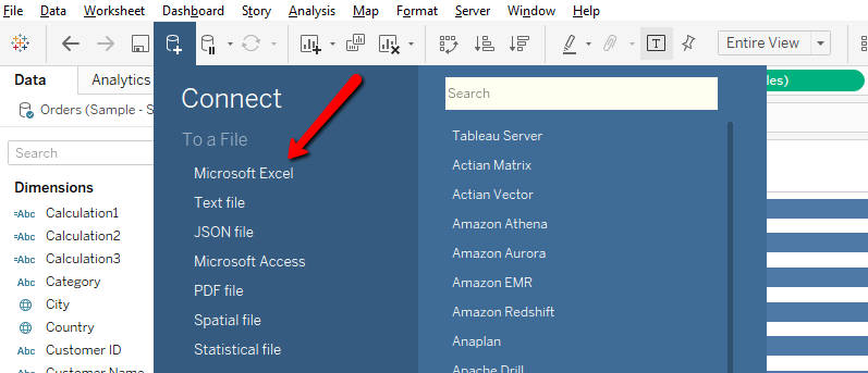
Step-4 Open Tableau Software and Connect respected data source. for example “Microsoft Excel”. After connected to datasource follow below step.

Step-5 Create calculation field in Tableau and give it name “Sentimental”

Create another calculation field to give it name “Color”. To check whether review is Positive, Neutral or Negative based on condition.

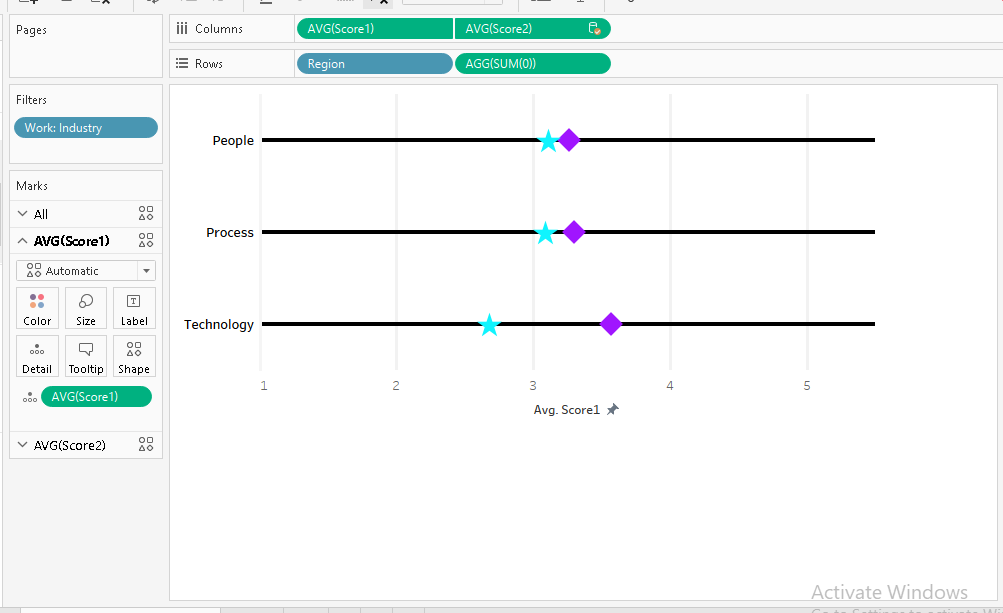
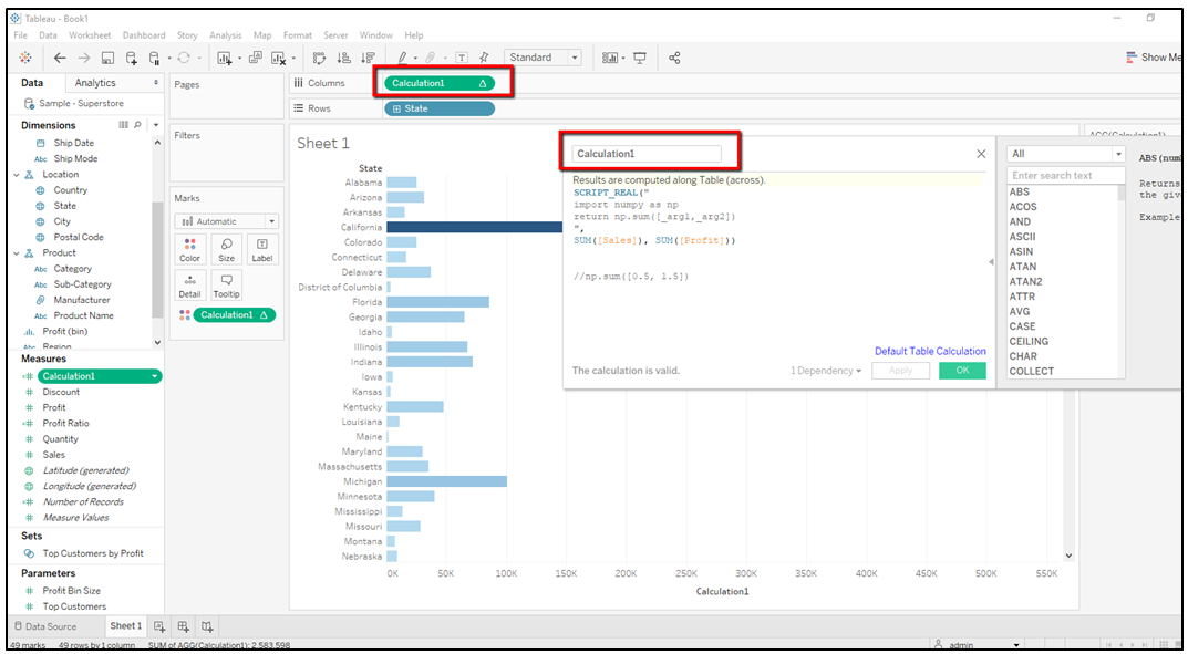
Step-6 Put the dimension and calculation fields in Column and Row Shelf as well in Mark shelf as per below screenshot.

Candy Type Chart

Step-1 Open Tableau Desktop.

Step-2 Create Data source for Sample POC Excel as per below.

Step-3 Connect Data-source with above Excel file.

Step-4
1. Drag “Candy Type” field dimension into Columns shelf
2. Drag “SUM(Sales)“ filed measure into Rows shelf
3. Drag “SUM(Sales)“ filed measure into Rows shelf
4. Right click on X-Axis and Click on Synchronize Axis
5. Right Click on “SUM(Sales)” in filed measure and click on Dual Axis.

Step-5
Go to “SUM(Sales)” Mark Shelf and Select Bar.

Step-6
Go to “SUM(Sales)” Mark Shelf and Select shape as per your preference.

Step-7 Drag “Candy Type” field dimension into Shape.

Step-8 Add All Shape in Below Path and Reload Shapes and Assign Palette based on Symbol.

Step-9
Please look below image for reference.

Rounded Bar Chart – Tableau

Step – 1 Open Tableau Desktop and click on New Data source icon to connect data source , for example (Sample Superstore)

Step – 2 Drag Dimension “Sub Category” into rows shelf

Step – 3 Drag “Sales” measure into Column Shelf , Hold the control button select “Sales” measure drag again into Column shelf.

Step – 4 Click on measure “Sales” and do dual axis between two measure. please look below image for reference.

Steps – 5 Make synchronize axis between two measure.

Step – 6 Select Bar shape type for first measure from Mark shelf

Step – 7 Select Circle shape type for second measure from Mark shelf

Funnel Chart – Tableau

Objective to create , A Funnel chart is a type of chart, often used to represent stages in a for example sales process

Step – 1 Open Tableau desktop , and connect to data source for example (Sample Super Store)

Step – 2 Drag Dimension “Subcategory” into rows shelf

Step – 3 Create Calculation for “Sales” filed

Step – 4 Drag “Sales” Calculated filed into Columns shelf

Step – 5 Drag “Sales” measure columns shelf

Step – 6 Make a dual axis between two measure “Calculated Field (Sales) “Sales”

Step – 7 Click on measure “Sales” then select “Show Header” option from columns shelf and then Do synchronize axis as per below screenshot

Please look below reference images to set Tool tip and Label from Mark shelf

Customize Line and Shape Chart for 2 value in one line.

Step-1 Open Tableau Desktop

Step-2 Connect Data-source Example like – XYZ data source

Step-3 1. Drag “Region” field dimension into Rows shelf
2. write SUM(0) in Rows shelf

Step-4 1. Drag “Score1” filed measure into Columns shelf
2. Drag “Score2“ filed measure into Columns shelf
3. RIght click on “Score2“ and select Dual axis
4. Right Click on Exis value and select Synchronize axis.

Step-5 Go to “Score1” Mark Shelf -> Shape -> Select shape as per your preference.

Step-6 Go to “Score2“ Mark Shelf -> Shape -> Select shape as per your preference.

Step-7 Right click on “SUM(0)“ -> select Formate -> go to Rows Tab -> Zeroline columns u can changes as per your preference.

Please look below image for reference

Python Integration with Tableau

Note: Below all steps only for Window Operating System

Step 1: Install “Anaconda3-4.2.0-Windows-x86_64” Setup and also you can download setup from below link. https://www.anaconda.com/distribution/

Step 2:  After installation go to Anaconda Navigator from start menu which is look like as below screenshot.

Step 3: Check “Tabpy – Server” and “Tabpy–Client” are installed or not in Anaconda Navigator? If not then click on environments which is on top left side. Please see below screenshot.

Install library Tabpy – Server and Tabpy–Client

Step 4 : After installation library(Tabpy – Server and Tabpy–Client) will come under “ALL” Dropdown , in Anaconda Navigator window. Please look below screenshot.

Step 5: Once step 4 is done then please go to respective path as per Anaconda installation and you can see Startup.bat file. Have a look below screenshot for reference.

Step 6 : Then go to command  prompt for above screenshot url and run/execute “startup.bat” file , Command window should return output as per below screenshot.

Step 7: Now go to Tableau Desktop to check integration between Tableau and Python.

  • Go to Help menu and click on below screenshot step
  • After Click on “Manage External Service connection..” then below window will open and Click on “Test Connection” button to verify integration between Tableau and Python. Once your integration successful done then below screenshot information will show.

Step 8: Now create simple calculation as per below code for Test, Create Calculation Field in tableau and do check.

SCRIPT_REAL(” import numpy as np return np.sum([_arg1,_arg2]) “, SUM([Sales]), SUM([Profit]))

Shape Chart – Tableau

To create shape chart . Here Shape size will increase as per their weight.

Before follow below steps please upload image into following path for example : C:\Users\User Name\Documents\My Tableau Repository\Shapes

Step-1 Open Tableau Desktop

Step-2 Connect Data-source Example like – Sample Super Store

Step-3 Drag “Region” field dimension into column shelf

Step-4 Go to Mark Shelf -> Shape -> Select shape as per your preference.

Step-5 Drag “Profit” filed measure into Mark -> Size & “Profit” filed measure into Mark-> Label

Please look below image for reference