Objective : To do navigation to sheet or dashboard we can use Dashboard “Button” object
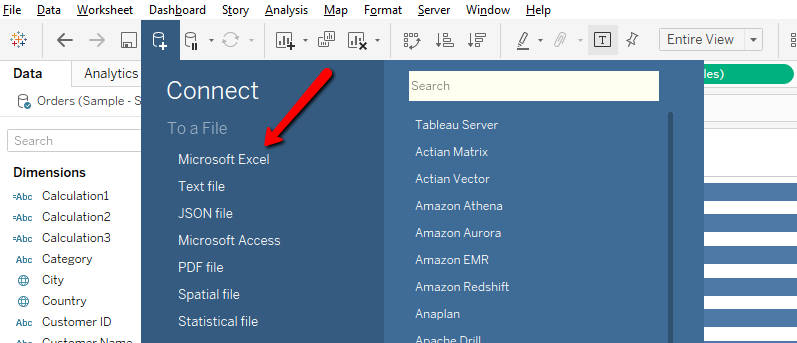
Step-1 Connect data source

Step-2 Create Dashboards to navigate between dashboards
Step-3 Drag “Button” object to Dashboard

Step-4 After drag “Button” object to dashboard ,click on “Button” object pill and click on “Edit Button” as per below screenshot.

Step-5 After click on “Edit Button” , you can see below window with various options.

- Navigate to – You can select Dashboard Name Or Sheet
- Button Style – You can select Image Button Or Text Button
- Image – You can set Image
- Format – You can set Border and Background
- Tooltip – You can set tooltip on button
After set all options click on “Apply” then “OK” button
Step-6 After set above options ,Click on “Button” object now you can navigate to respected dashboard which you selected from option “Navigate to”